
Work > UX/UI Design
Creating a Design System for Web Applications
Employer / Thermo Fisher Scientific
This page is password protected.
Summary
At Thermo Fisher Scientific, I led a three year effort to extend the design system to support multiple scientific web applications in order to drive alignment towards a cohesive software ecosystem. I designed a repeatable process of discovery, strategy, UI design, accessibility evaluation, collaboration, and documentation, that enabled us to create standardized components to improve usability and efficiency. An example project is drag-and-drop, for which we developed a flexible Figma kit that allows designers to quickly apply interactions across various contexts.
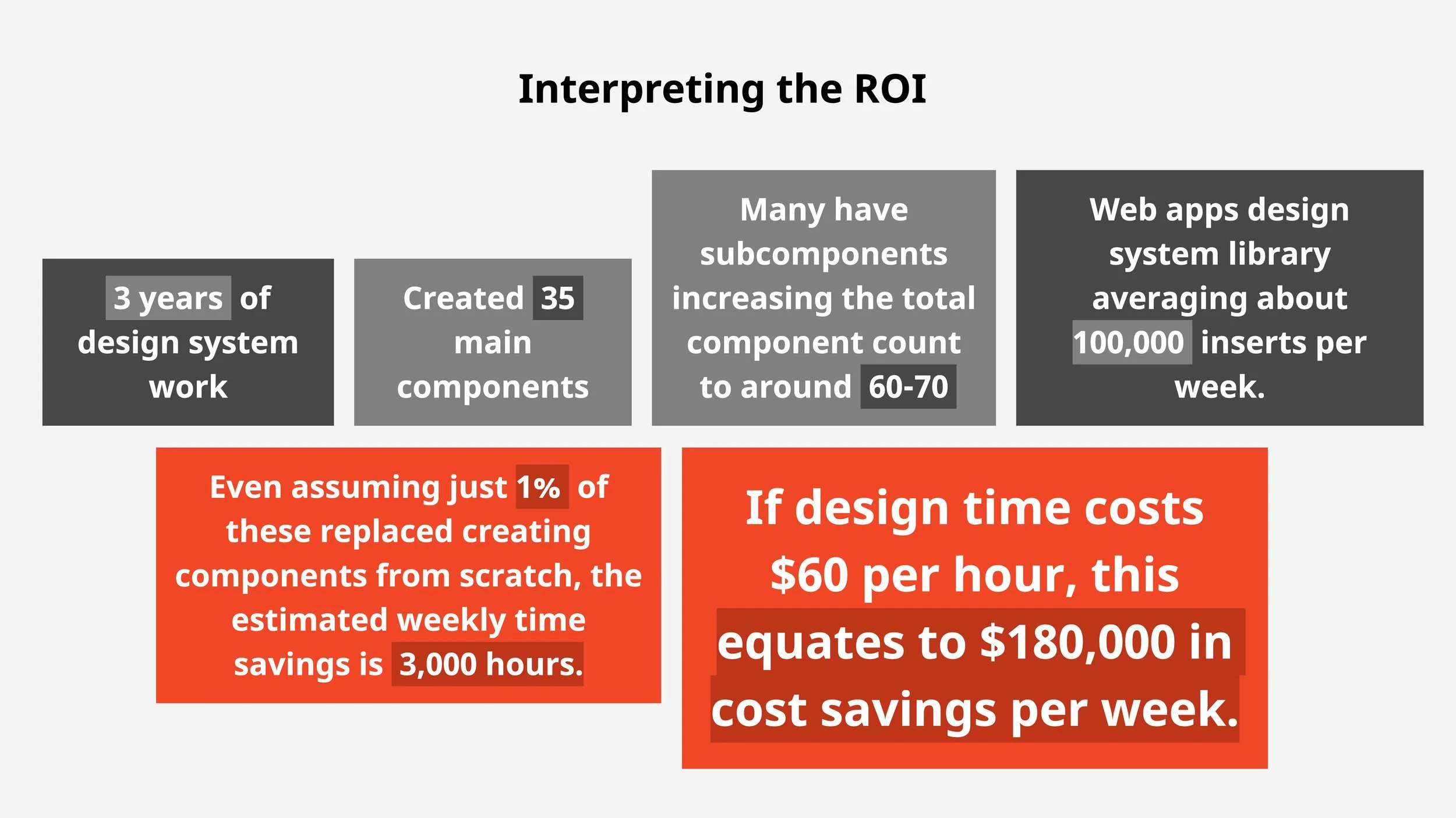
Over three years, the team contributed 35 main components (60–70 including subcomponents). A conservative estimate is that this saves an estimated 3,000 hours weekly through component reuse across many products — with a potential cost savings of $180,000 per week.
Project background
At Thermo Fisher Scientific, I serve as the UX product lead for extending the design system to better serve the company’s scientific web applications. Historically, products were developed in silos with a few shared components from the existing generic design system. The new initiative focused on extending the design system into a new library of more complex components, like platform navigation systems, data tables, and onboarding kits, that specifically serve web applications. I led a cross-functional teams of designers, guiding them through UX strategy, UI design, Figma component creation, and documentation. The case study that follows highlights the development of a drag-and-drop pattern integrated into our design system.
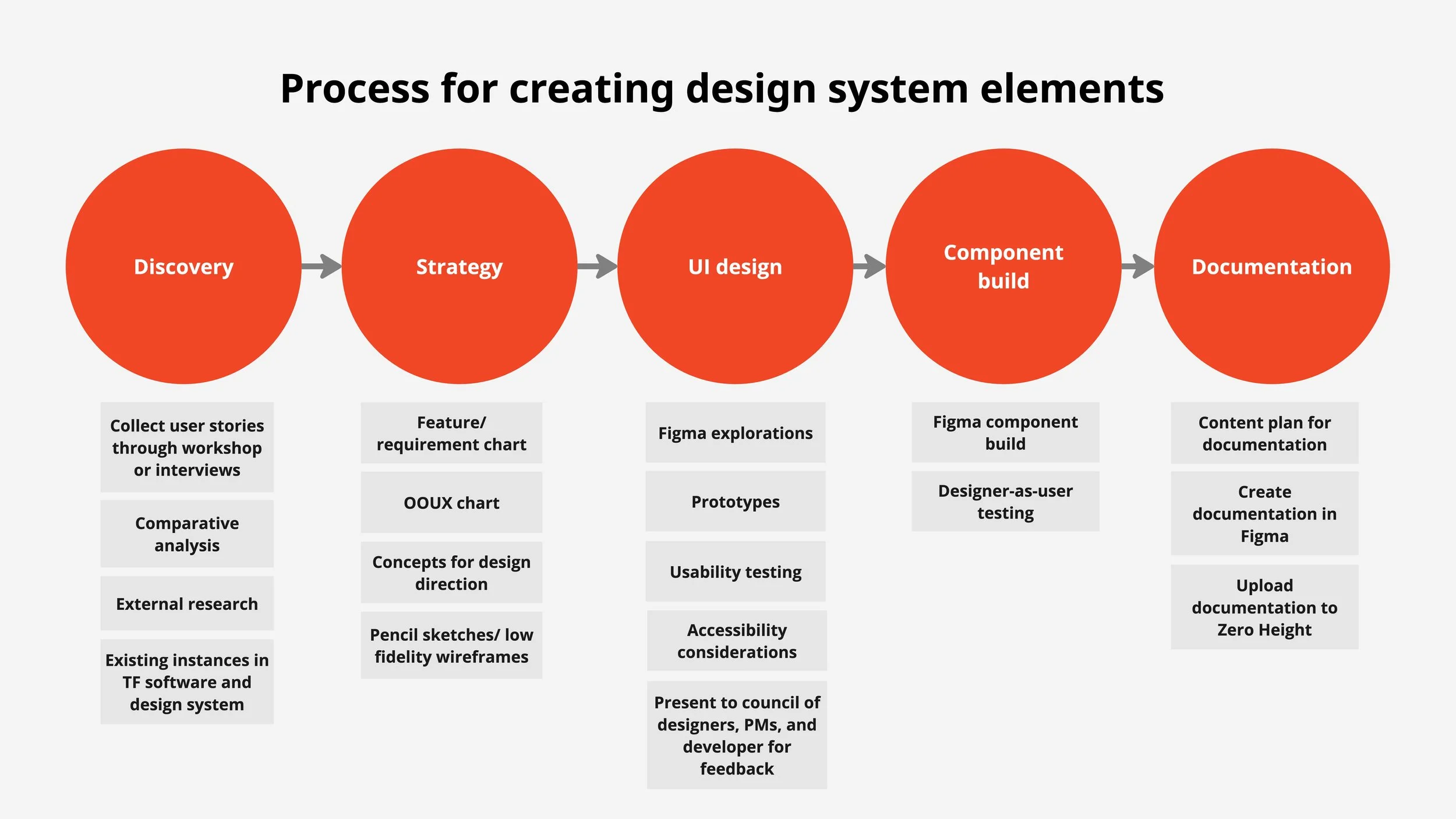
The Repeatable Process
The process I established for my team for building design system elements ensures that our components meet the following standards:
Address common, shared needs across platforms
Adhere to human-centered design best practice guidelines, including accessibility
Have clearly defined and documented behaviors and intended use cases
Are intuitive and easy for our designers to use in Figma
Below is the checklist of steps our team cross-referenced for each project – with the understanding that each project is different and only the steps that best serve it’s needs should be utilized.
Images too small? View PDF.
A Case Study: Drag-and-Drop
Discovery
Starting with discovery, the team chose to execute the following exercises:
Collect examples of existing drag-and-drop designs in our applications: One of the key drivers for this project was the variability in UI and behavior across our applications. By gathering examples of current implementations, we could better understand the landscape of drag-and-drop use cases and assess the level of consistency (or lack thereof) across applications.
Review our existing design system for any guidelines on drag-and-drop: We found some outdated, deprecated guidance on drag-and-drop in an old file. Some of the drag-and-drop patterns we observed in the apps were loosely based on this old direction, while others deviated significantly from it. Additionally, this guidance was no longer available on the live documentation site.
Conduct a comparative analysis with other design systems: This exercise allowed us to explore how other prominent design systems approached drag-and-drop UI and behavior. It also helped us classify the different types of drag-and-drop interactions we had identified in our own applications.
Conduct a comparative analysis with other products: We looked at drag-and-drop implementations in other web applications, noting what worked well and what didn't, to inform our own design decisions.
Interview our designers: Since this project didn’t require an exhaustive list of requirements, we interviewed a few of our designers to understand the reasoning behind the existing drag-and-drop styles we had collected. This also gave us insight into potential areas for future revision or resistance we might face.
Conduct external research on best practices: This focused primarily on accessibility research, which we’ll delve into further in the case study.
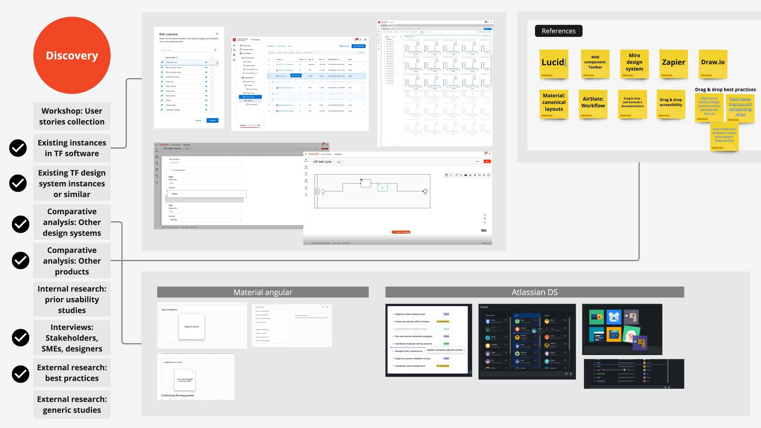
Checkmarks indicate which steps from the toolkit were used in the drag-and-drop discovery. Images too small? View PDF.
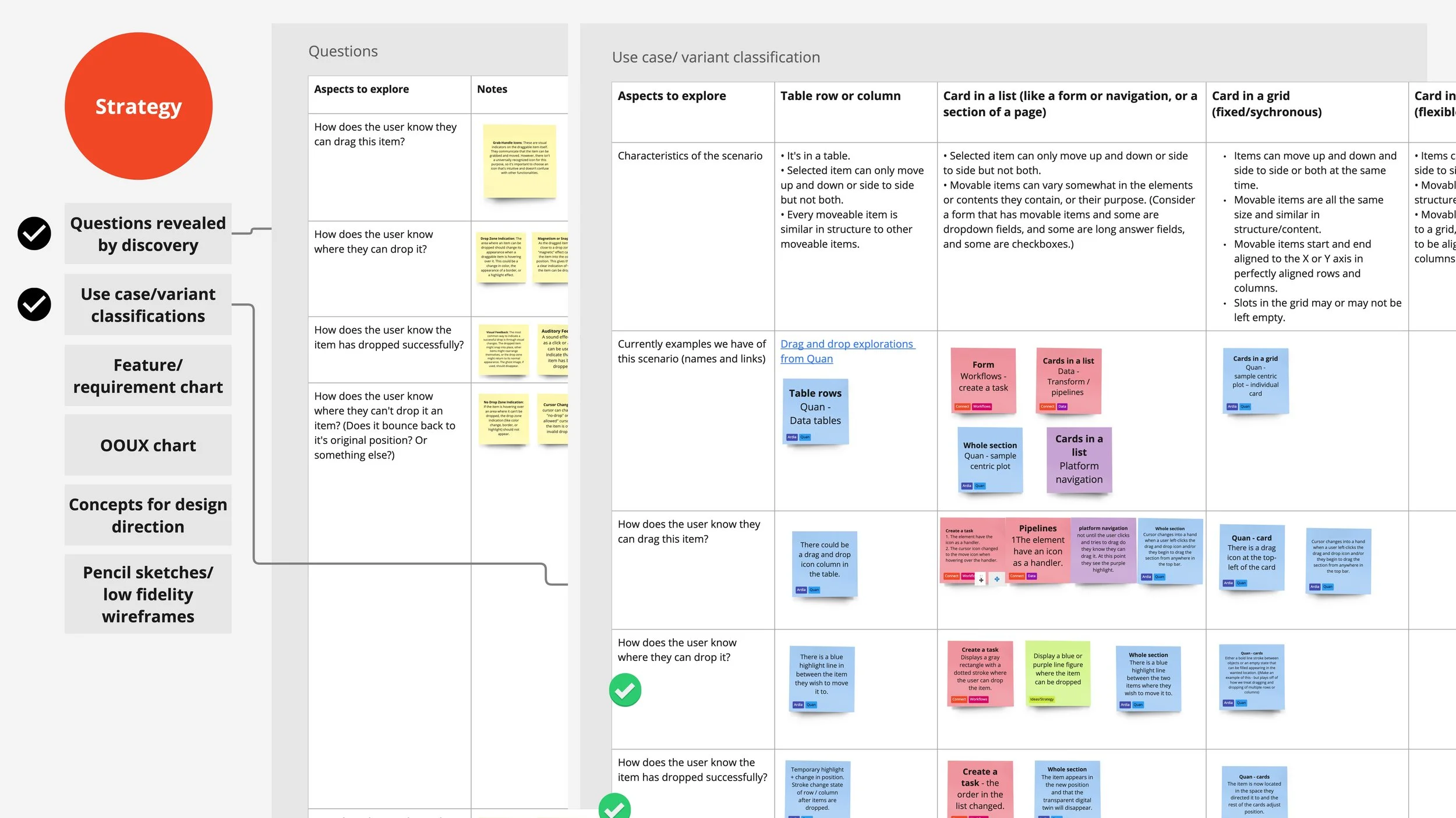
Strategy
Variant classifications
In the strategy phase of the project, we began synthesizing and classifying our findings. This allowed us to map out the landscape of use cases, which we then grouped into distinct variants:
Cards in a list: This includes scenarios such as list items, vertical or horizontal movable navigation elements or whole sections within a page. These cards may move within a linear list – ie only two directions, up and down, or left and right, but not both.
Cards in a fixed grid: In this case, cards can move up or down, or left or right, but the cards shift to fill any empty slot, meaning the layout is rigid and constrained.
Cards in a flexible grid: Here, cards can overlap on the z-axis and move in any direction. This type of grid may not be easily perceivable to users due to its flexibility.
Table rows or columns: These have similar behavior to cards in a list, but have differing UI needs due to their tight proximity to their siblings and limited interior padding. Table rows also are differentiated in that in some applications they can be dropped one inside of another to create a nested row.
Shapes: This variant involves dragging various shapes, potentially for diagramming or systems designing purposes.
We documented each classification, identifying which examples aligned with each category, as well as the affordances and behaviors observed in those examples.
Images too small? View PDF.
OOUX chart
Next, we recognized the need to simplify this information and present it in a format that linked the different states of a drag-and-drop micro-interaction with the observed affordances. We adopted a model based on object-oriented UX, which connected objects with their action states, affordances, and behaviors. This approach allowed us to identify redundancies and potential conflicts if all these elements were incorporated into our design system. It also enabled us to make informed decisions about what to adopt and what to exclude.
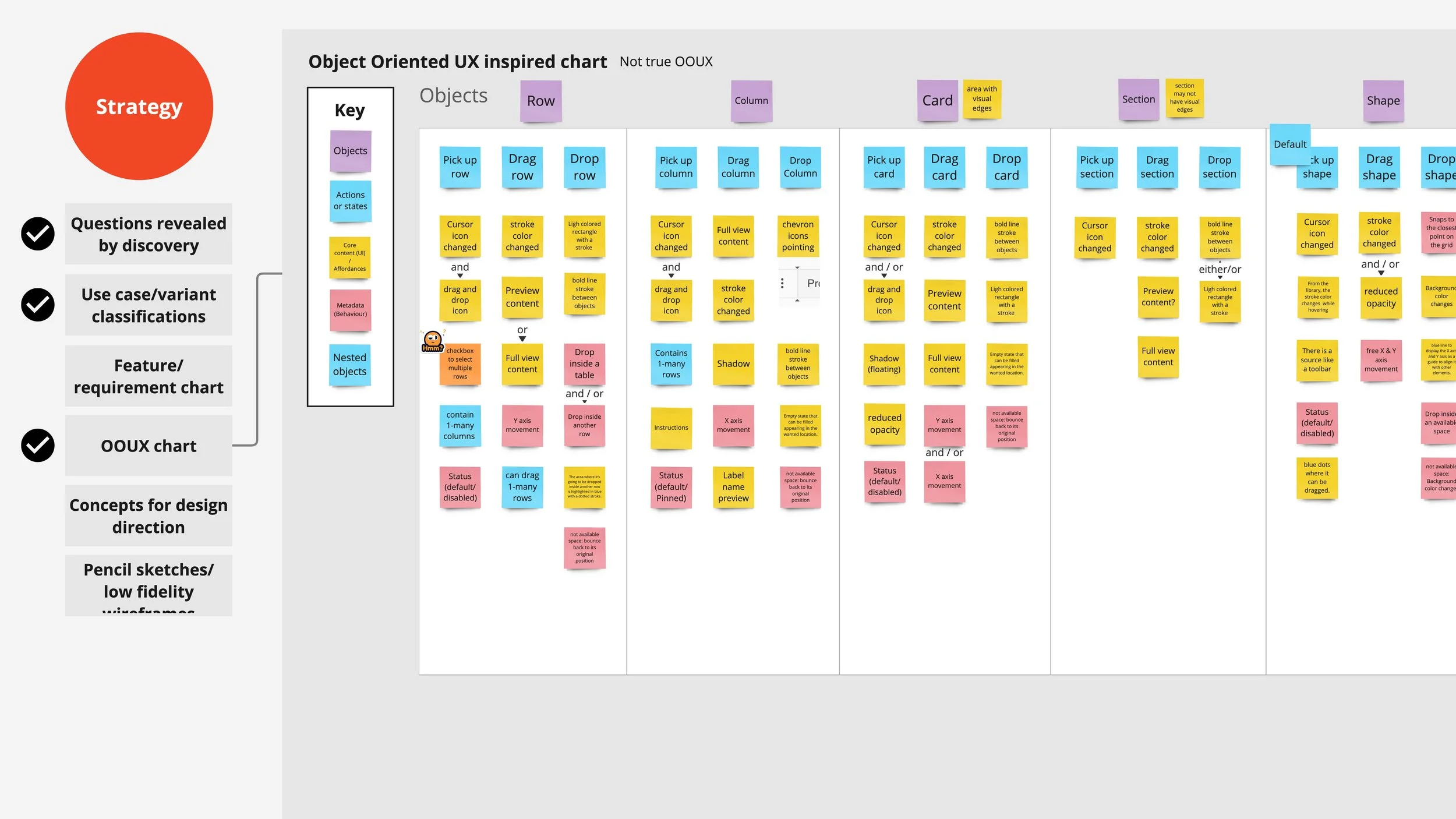
Images too small? View PDF.
UI Design
Explore UI in Figma
In the next phase, we moved into Figma. While there was still some simplification to be done, seeing the visuals side by side helped us refine our approach. This allowed us to identify the smallest amount of variation needed in our design system to maintain consistency, while still addressing all of our known use cases.
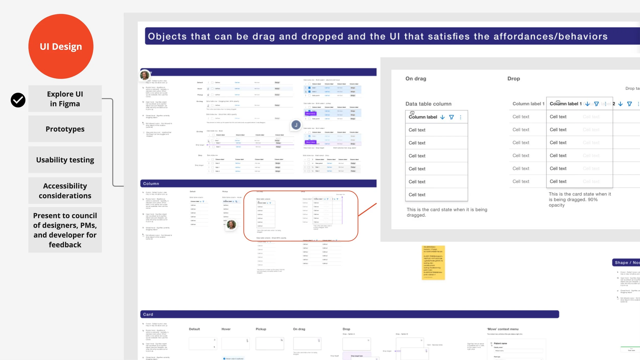
Images too small? View PDF.
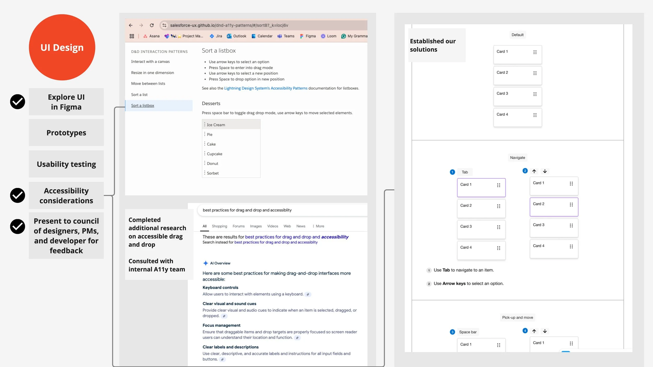
Accessibility
At this stage, we revisited our accessibility research and evaluated how each of our drag-and-drop classifications might align with accessibility standards. A particularly valuable resource was Salesforce's publicly available A11y study on drag-and-drop, hosted on GitHub. Interacting with these coded components helped us refine our understanding of the micro-interactions, including both mouse-based and keyboard navigation for various drag-and-drop variants.
While I don’t recall if we specifically used AI to identify accessibility considerations for drag and drop, it’s a tool we’ve leveraged in other design system projects to uncover or remind us of common features or accessibility requirements.
Images too small? View PDF.
Collaborative decision-making
The collaborative nature of this design system project is supported by weekly meetings where several teams working on different applications and platforms come together to review progress. During the collaboration calls, a core group of designers from just two web apps platforms provide feedback on work at any stage of development, while the demo calls allow product managers and designers from other teams to view more finalized work.
As the UX lead, I facilitated these collaborative calls but in most cases we looked for the group to have no further objections to a presentation, before considering it approved and moving forward with implementation.
The drag-and-drop component was presented during several of these calls, gathering valuable insights along the way. One memorable discussion revolved around the use of purple to signify temporary states, like dragging.
Component build
Figma
The drag-and-drop component is one of the few kit-style components we added to the design system. Unlike most components, which are fully integrated with customizable properties (and more complex ones featuring nested subcomponents), a kit-style component is a collection of simpler elements used in conjunction with other components to represent interactions.
Since the drag-and-drop interaction can be applied to tables and various types of cards, it's impractical to build these elements into every component that has a drag-and-drop interaction. Instead, the kit lets designers add drag-and-drop functionality to any component as needed. A similar example is our onboarding flow, where separate elements must be placed across a page to create the intended experience.
To make the drag-and-drop kit easy to access, we created a single drag-and-drop kit component that houses all the parts. Designers can search for it in Figma, drag it onto the page, and detach the kit to access each piece. This approach improves the experience, eliminating the need for designers to search for each individual part.
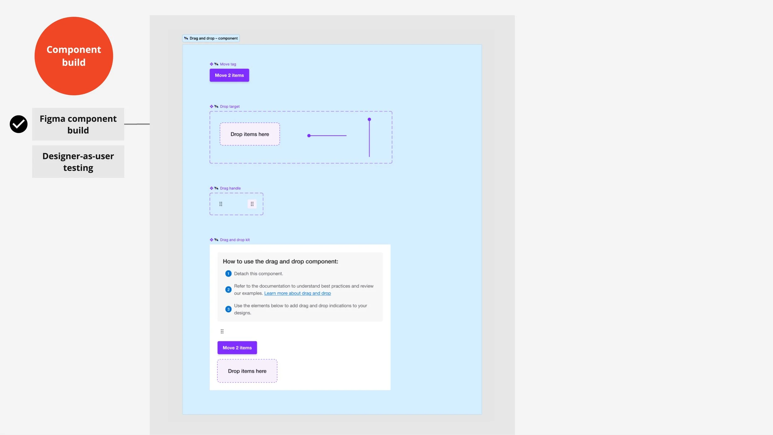
Images too small? View PDF.
Documentation
Content plan
The final step is to document the component and all the decisions we’ve made about it’s behavior and interactions, and the names we’ve given to it’s parts and it’s variants and other types of classifications. Since documentation can be challenging to structure, we use a template to create an outline for our concepts. This follows our standard documentation structure with the primary categories being variants, anatomy, states, interactions, specifications and usage guidelines.
In the case of the drag-and-drop, we added a section for our classification or what at this point we renamed “Example movable items” for easier understanding.
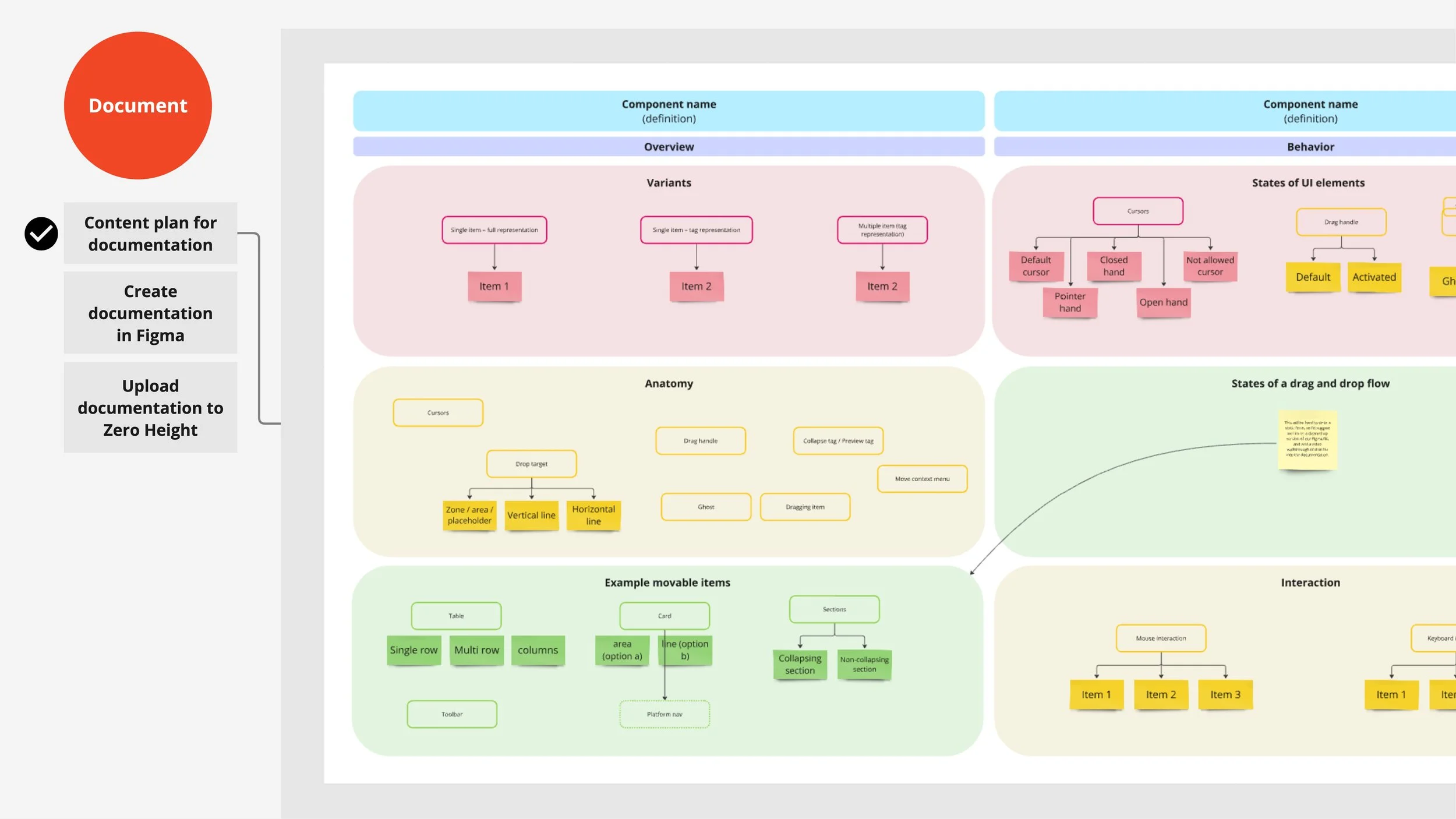
Images too small? View PDF.
Documentation draft in Figma
Once our team agreed on the documentation outline, we used our Figma template to insert images and copy.
Since we couldn’t create interactive prototypes to capture the nuances of drag-and-drop microinteractions, we documented these using a series of static images. Given the number of movable elements, this became quite lengthy, so we decided to focus on documenting mouse-based microinteractions in the formal documentation and link to keyboard navigation flows hosted separately in Figma. Additionally, we provided narrated video walkthroughs of these flows for better clarity.
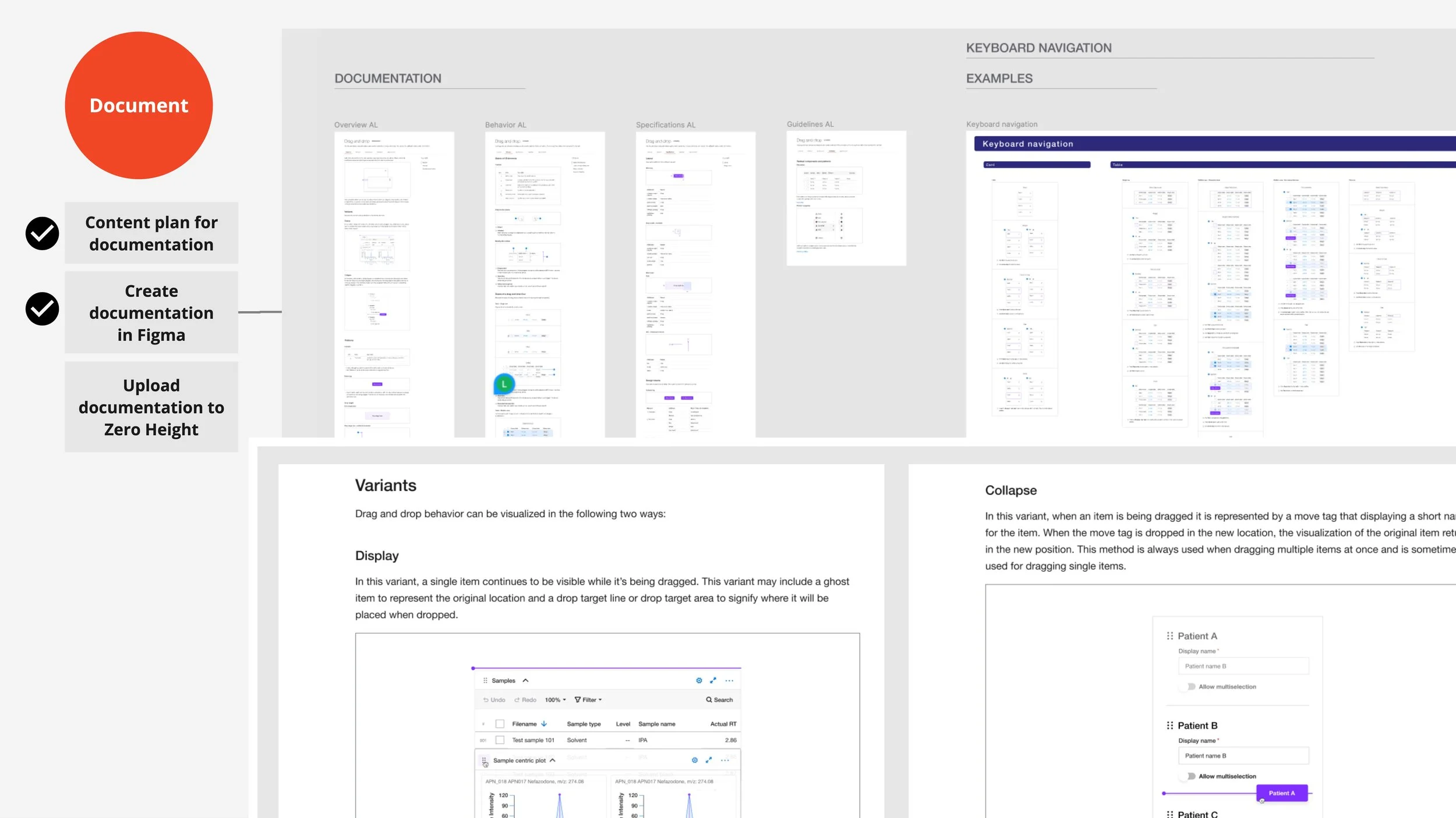
Images too small? View PDF.
Documentation can be tricky, as our audience includes both designers and developers. Designers can learn about the element through the Figma component, but interactions are harder to convey that way. Once the coded web component is built, platform developers will no longer need the detailed interaction specs—they’ll need more practical information on how to use the coded component and its variants. In the future, this documentation may be streamlined to better meet the needs of the specific audience at that time.
Live documentation website and announcements
The final steps involve uploading the documentation content to the live site hosted on ZeroHeight and announcing the component’s readiness to the web application design team.
ZeroHeight is a WYSIWYG tool that I introduced to the organization a few years ago after discovering it at a UX meetup. It’s been a game-changer for us, as our previous design system website required developer assistance for updates.
When I send out the announcement to the design team, I always include a thank-you to the designers who dedicated time each week to collaborate on the project. I also provide links to the Figma component, the documentation, and any tutorial videos where applicable.
ROI
Over three years, the team working on the design system for web apps contributed 35 main components. Many of these included subcomponents—for example, a data table encompassed elements like content cells, header cells, and toolbars. At the subcomponent level, we estimate a total of 60–70 components.
Some of the components were adopted by the primary design system, enhancing its utility for digital products beyond web apps. For the 30 or so subcomponents not adopted into the primary design system, Figma analytics revealed that by the conclusion of the program, designers were inserting these components approximately 100,000 times per week.
Images too small? View PDF.
Even with conservative assumptions, this represents a significant time savings. If just 1% of these component inserts replaced the need for a designer to create a new component from scratch—a task estimated to take 3 hours—this translates to 1,000 components × 3 hours each = 3,000 hours saved weekly. At a rate of $60 per hour, this results in a potential cost savings of $180,000 per week.
While this calculation involves some speculation due to various variables, it leans on conservative estimates. The data clearly underscores substantial time and cost efficiencies, as well as a meaningful reduction in design completion times.
UX/UI Design


