
THE IDEA
Problem
Planning a successful garden is a complex task affected by many variables including, available sunlight, the location plants have occupied in the past, the speed of growth, the expected final size of a plant, the soil conditions and much more. Planning for all these variables can be confusing to gardeners. This may cause disappointing harvest yields, which in some cases may dissuade inexperienced gardeners from trying again the following year.
Proposed Solution
Create a native app for planning a vegetable garden that suggests when, where and what to plant based on data users provide about the space they have available.
Development Process
Phase 1: Audience and MVP Research
Phase 2: Information Architecture Strategy
Phase 3: Visual and Interaction Design
Phase 1: Audience and MVP Research
Research Exercise
Audience Research
In order to assess the current practices and possible needs of gardeners, I conducted a google survey with 21 respondents and five in-person interviews.
The primary goal for this shift was to add wagering functionality to the app. Secondarily, but still importantly, the visual interface and the information architecture of the legacy app was significantly outdated.

From these two data sets we can deduce that the top 3 variables that people consider in their garden planning are crop rotation, space needs and planting and harvesting dates. We can also see that although a smaller amount of people consider soil conditions and sun needs to be variables to consider, that for those who do consider it, they consider it very important.
No one reported using a digital solution which could mean an opening in the market or no interest in the product. Other types of research would be needed to discern between the two.
Research Exercise
Heuristic Analysis
There are very few apps currently available that help users plan a garden by automating more than two variables. There are no apps that provide automation on more than four variables. I chose apps that automated at least two variables and therefore seemed the most relevant to the to study for a heuristic analysis.
_
Studied Apps Include:
Grow Veg/Garden Plan Pro by Growing Interactive (this company white labels their application as well and so the same application can be found driving several apps including the Old Farmer’s Almanac Garden Planner and Grow Planner for Mother Earth News).
The Garden Planner by Kaiden Ficklin
Gardening Companion by Gardening Know How, LLC
Mixed Cultivation Planner by Ruth Reinert
–
These apps were studied for the following Nielson Norman Heuristics:
Match Between System and the Real World
Consistency and standards
Help and documentation
–
Findings:
Match Between System and the Real World – For this criteria, the most significant failure was the arbitrary order of the plants in the plant list in the Mixed Cultivation Planner We commonly expect long lists like this to appear in alphabetical order if there is no other order that has more relevance in that particular field.
Match Between System and the Real World – All the apps used language that would be familiar to the audience. The Garden Planner was particularly logical with it’s four simple single-direction steps that lead to a result.
Consistency and Standards – The Grow Veg/Garden Plan Pro has two menus that have the same look and location (left side hamburger) but different content depending on whether you are on the home screen or inside one of your garden plans. When you are inside one of your plans it's easy to assume that menu should be the same as the one you saw when you were on the home page — but it’s not. And it’s not clear that you need to go back to the homepage to access the links that were available on that menu. This is a pretty significant failure.
Consistency and Standards – The Garden Planner uses a gear icon, commonly associated with a settings menu, in the top right corner. However, tapping this icon takes the user back to the first screen of the app which asks for your growing zone. I can loosely see the connection here, but it was a bit of a surprise the first time to be taken here rather than a typical settings screen.
Consistency and Standards – Gardening Companion uses consistent language and is the only one of these apps that uses a consistent menu throughout. The hamburger is always available and always reveals the same links no matter where you are in the app.
Help and Documentation – In the plan screen of Grow Veg/Garden Plan Pro when the tools at the top are selected, a line of explanation for the tool appears in a small bar above. We are also told what will happen if the icon is tapped again. This is extremely helpful.
Help and Documentation – The square foot gardening mode of Grow Veg/Garden Plan Pro confused me enough that I had to contact the service team. I had it turned on, but later wanted to plan an area of the garden that wasn't a square foot garden and forgot that I had to turn it off. Maybe the app should detect that you are trying to place things in a way that's counter to a square foot garden method and provide an alert that the mode is turned on.
Strategy Exercise
Personas
After conducting 5 recorded interviews with gardeners, I transcribed the interviews and synthesized what I learned. This information was then used to develop 2 personas for potential users of the app.

Strategy Exercise
Features of the Minimum Viable Product
Choose 1 of 10 preset garden configurations
Indicate north/south orientation of my garden.
Choose the plants I want to grow from a list
Receive an auto-generated garden plan in the form of a map and a calendar of planting and harvesting dates and water schedule based on the data provided.
Have the ability to rearrange the priority order of the variables that result in the garden plan.
Phase 2: Information Architecture Strategy
Research Exercise
Card Sort
The main conclusion drawn by synthesizing the results of the card sort is there is some confusion around the difference between the screens which guide a user through the creation of a garden plan and the screens that provide the resulting customized garden plan that users will return repeatedly to consult. The solution I will use to solve this problem is to add a level of hierarchy in the architecture and menus to give distinction to the two areas.

Strategy Exercise
User Flows
Below is the flow of action that users will use to enter their garden data and generate a custom plan. The clear distinction between the two sets of screens (as discussed above) is shown here and are named "Create a Plan" and "View a Plan".

Strategy Exercise
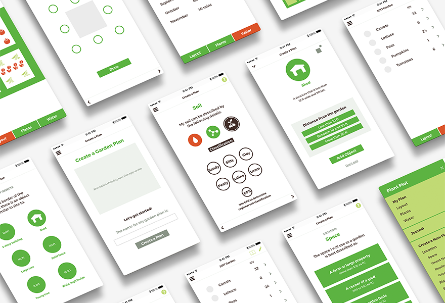
Wireframes
By completing an initial draft of wireframes with paper and pencil, I was able to quickly iterate through page architecture ideas. Through this process I was also able to see that certain screens included in the user-flow were actually not needed because a main navigation set up as an off-canvas drawer navigation would serve the purpose better.

Phase 3: Visual and Interaction Design
Strategy Exercise
Visual Design

Strategy Exercise
Prototype
Using UXPin to translate my wireframes into a clickable prototype allowed me the ability to:
Fairly quickly create a prototype for a usability study.
Quickly iterate through some functionality issues that revealed themselves in this clickable format that weren’t apparent in the static wireframe stage.
Apply a simple visual design based on my brand guide. By applying fonts in their real sizes I was better able to determine how much space text will realistically take up. By using the actual color palette I was able to observe how the actual colors might be useful (or not) as a signifier in the first round of usability tests.
Research Exercise
Usability Study
I conducted a usability study in order to validate the designs. The study consisted of 5 participants who were asked to use the UXPin prototype to complete 5 tasks.
_
Observation
Task 1 | Orient North Page
Participants were asked to create a garden plan based on specs provided to them. Several participants pointed out that they were looking for a “Done” button on the “Orient North” and “Soil” pages rather than simply using the arrow navigation to move to the next screen. They all eventually figured it out without any assistance but they indicated their first instinct was to look for a button.
Suggested Revision:
Add a “Done” or “Next” button to the “Orient North” page.
Add a “Done” or “Next” button alongside a progress bar for the three subcategories on the “Soil” page.
_
Observation
Task 2 | Planting and Harvesting Schedule
Participants were asked to figure out what is the earliest date they should plant their carrots. Two participants struggled to interpret the schedule graphic as a calendar. The other three understood it as a calendar but all except one struggled to understand what the calendar indicated. Although a key was available by clicking the “?” icon at the top left, only one participant clicked it.
Suggested Revision:
Add a title bar above the calendar reading “Planting and Harvesting Schedule”.
Add labels onto the green and red bars that read “Planting Dates”, “Harvesting Dates”.
_
Observation
Task 1 | Soil Page
Participants were asked to create a garden plan based on specs provided to them. On the “Soil” page, the method of secondary navigation that is used is unlike any other on the app. Participants struggled to understand the icons. Some clicked on them and then learned via the label what they stood for, but most either stared at them and wondered without clicking, or didn’t even notice the “Nutrients” and “Class” sub categories and just moved on to the next page.
Suggested Revisions:
Add “1”, “2” and “3” indicators to the three sub categories.
Consider adding labels for each that are visible at all times.
Digital Experience Work


