
Horse Race Web App:
UX Design, Usability Research and Visual Design
Client / Horse Races Now
About This Project
Horse Races Now (HRN) offers an app for horseracing enthusiasts that offers a greater amount detail on race participants and statistics than any of its competitors.
User Experience Challenge
Horse Races Now hired me to help with overhauling its legacy native app by designing a new app following native principles that the internal development team planned to build using code for a responsive webapp and then port that into a native environment. (Lesson learned: This code development method is difficult, if not impossible, to pull off.)
The primary goal for the redesign was to add wagering functionality to the app. Secondarily, but still importantly, the visual interface and the information architecture of the legacy app was significantly outdated.
This project included many user experience challenges, but for this review I’ll focus on:
the task-flows for the favoriting functionality
the secondary navigation for the race program which allows access to all data related to that race, including wagering, and navigation to other races at the same track
Research Exercise
Roadmapping
The project began with roadmapping work that included the following components:
Compile feature list
I conducted a thorough review of the existing app to list, categorize and prioritize features. New features were also added to the list.
Competitor Analysis
A review of 2 competitor products provided insight into which functionality users of existing wagering apps may be familiar with and it also helped to generate some ideas about ways we could improve upon these competitors’ designs.

Proto-Personas
Working with insights from the HRN team, several proto-personas were created for the users of the app. We’d later use these as a guide for recruiting usability research participants.

Strategy Exercise
Low-Fidelity Wireframes
At this stage, we explored task-flows through low-fidelity wireframes in order to establish group consensus.
Race Program
The race program screen mimics the real world experience of viewing a paper “program” of the race details when at a track. It provides all the details of who is racing, handicapping and other statistics about the horses. As in the real world experience, it is typical for horserace enthusiasts to be interested in following several races happening at a single track on a given day. Therefore, it was deemed important to allow the ability to navigate directly to the other races at a track when viewing the program for any race at that track.
A primary and secondary navigation pattern was used for other screens but this content seemed to require two secondary navigation options — one to be used for anchor links to all the content on that screen (including quick access to the wagering module, which is the primary business objective); the other so that users could access other races at the same track.
Therefore, this secondary navigation was designed to serves a dual purpose by toggling between two modes — anchor link view and race number view.
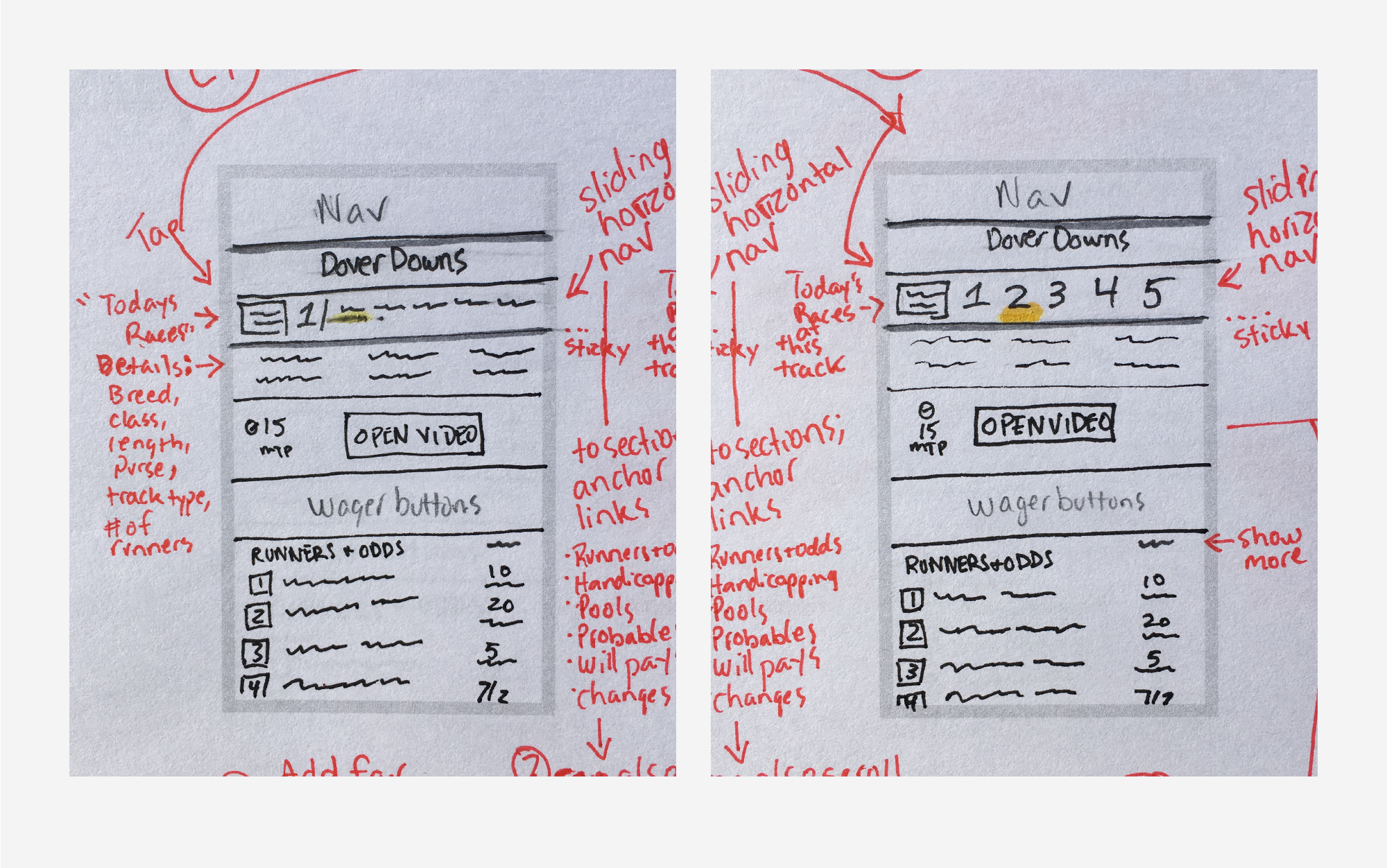
The upper left image shows the secondary navigation displaying the track that is currently viewed (track 1) followed to the right by anchor links to the content areas further down the screen. If the icon to the left of the track number is tapped, the secondary navigation mode switches to allow navigation to a different race at that track; shown at upper right.
Favorite Horses, Jockeys, and Other Participants
The robust ability to favorite horses, jockeys and trainers and view stats on these participants is a feature that sets Horse Races Now apart from its competitors. The aim was to enable the ability to add favorites from the program view and to sort and find favorites more easily that what was available on the legacy app.

The wireframe on the left suggest a method for viewing favorites in a single list or sorted out by category. Users may also add favorites when they appear on a race program.
Strategy Exercise
High-Fidelity Wireframes
Stakeholder feedback to the low-fidelity wireframes was incorporated into these high-fidelity wireframes.

Research Exercise
Usability Research
Remote moderated usability research was carried out with 3 participants for 1 hour each. The participants were given 10 tasks to complete in various areas of the app.

Through this research we learned that the areas where we suspected users to struggle — finding races and placing wagers — actually seemed to work quite well for participants.
However, we discovered some usability issues in the “favorites” section of the app. Users weren’t convinced that the option to view all the favorites together under “all” would be useful if the horses were mixed up with jockeys and trainers in a single list. They were also confused by how to add favorites from a race program screen.
UX Solution
Ultimately the element I was concerned about — the dual secondary navigation — passed the usability test, while the “favorites” feature — an element that I was confident about — needed more work.
Another round of wireframes presented alternate solutions to the insights gathered through the usability research.
Visual Design
Mockups

Style Guide

UX/UI Design


