
Work > UX/UI Design
Online Insurance Quote Process:
UX Design and Usability Research
Client / biBERK (Subcontracted through The Creative Alliance, Lafayette, CO)
About This Project
Our team was tasked with exploring opportunities to improve the user experience of biBERK’s online business insurance purchase flow. Over an 18 month period, I contributed to the research and strategy of the following parts of the purchase flow:
Recommendation engine
Professional liability application
Commercial auto application
The case study outlined here documents our research and strategy recommendations related to the recommendation engine portion of the flow. The recommendation engine collects from the user the information needed in order to recommend insurance products appropriate to the user’s business.
Research Exercises
Proto-Persona Insights
In an earlier phase of the project we had identified user needs and goals primarily based on our knowledge of small business owners and the client’s experience with this audience. We also incorporated a few insights from the client’s sales data to set their particular customers apart from general small business owners. These insights were carried over from the earlier phase into this redesign of the recommendation flow.
Usability Research on Existing Product
Assessment of Existing Flow
As a first step to understand the user experience, we examined all the ways the existing product allowed a user to begin requesting an insurance quote or to find out which insurance product was right for their business. The findings were diagrammed in a user-flow.
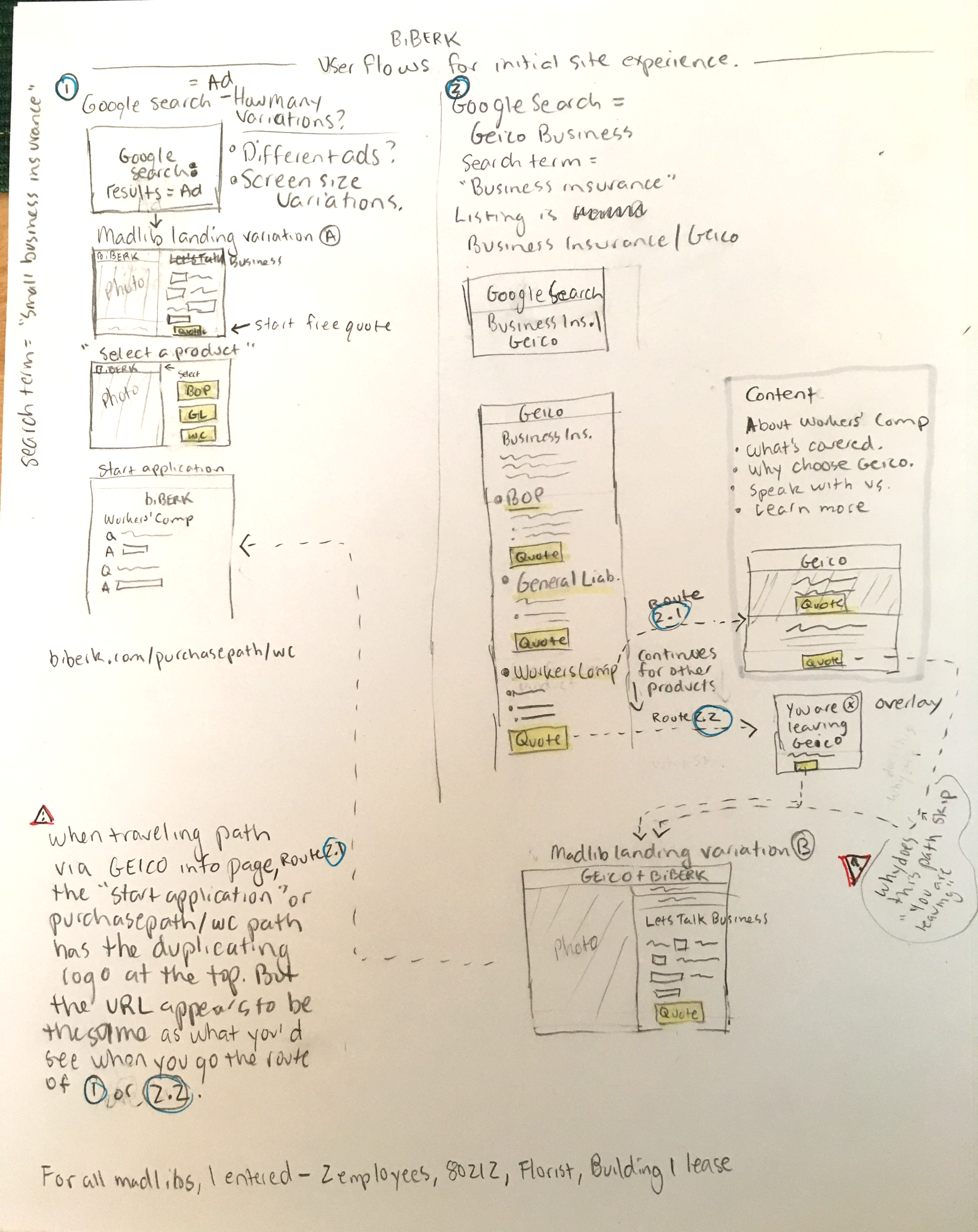
Unmoderated Research
Using the analytics platform, Full Story, we watched how actual users moved through the existing recommendation flow. We noted frustrations, roadblocks and confusions. We also noted the variety of ways that users interacted with the application. For instance, some users answered the questions in order, while others did not; and some users carefully scrolled through the results of a broad query on the dropdown list, while others did not realize a dropdown list was available after entering 3 characters (which we assumed was either because they typed too fast and the system’s response we slow or because they were looking at their keyboard as they typed). We reviewed the use of the product by both desktop and mobile users.
Competitive Analysis
Competitor Flows and Functionality
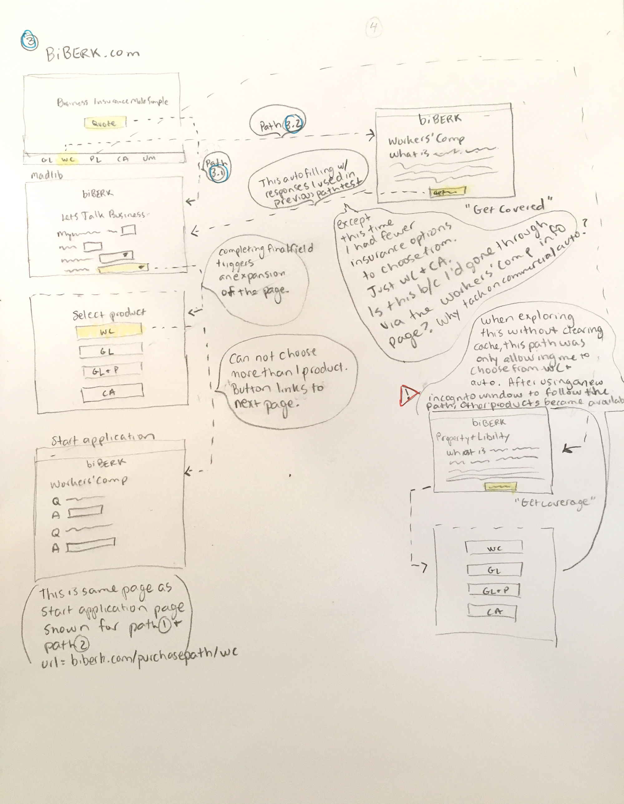
We explored the online business insurance applications of 5 competitors by completing their application forms and noting the functionality, flow and descriptive language used by each. For a few of these, we also documented the experience through user-flows to better understand the architecture.
Unmoderated Competitive Analysis
Participants of this unmoderated study were ask to complete a portion of 3 competitor’s insurance applications. The participants were instructed to use information representative of the business they actually own. The 3 competitor applications that we examined in this study were chosen because they offer functionality that was similar to style we were considering for our redesign. In particular, we wanted to better understand certain aspects of the usability of different methods that could be used in order to collection information about the user’s business’s industry.
Strategy Exercise
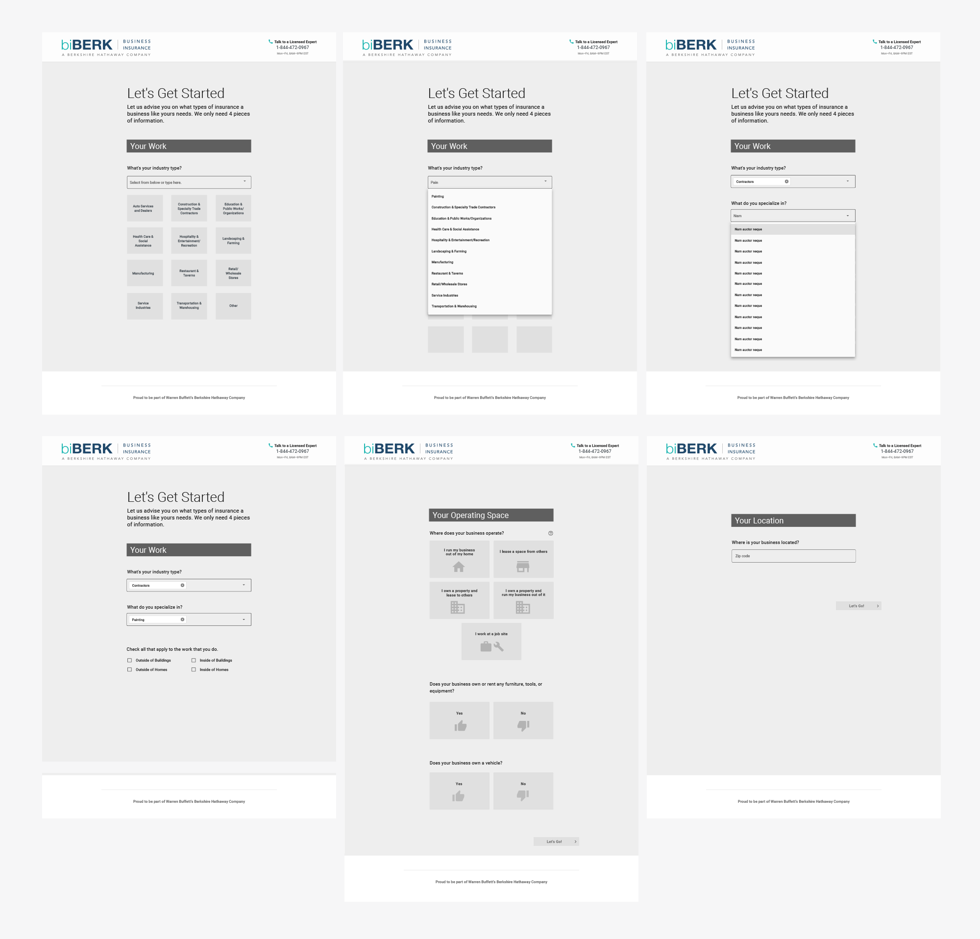
Low-Fidelity Wireframes
Next we strategized new experiences for the recommendation engine by experimenting with several redesigned flows through low-fidelity wireframes. We explored flow architecture, functionality and page layout ideas using the research findings and several iterations of creative problem solving.
Prototypes
The team and client discussed the wireframe designs and decided on two of the ideas to convert into prototypes.
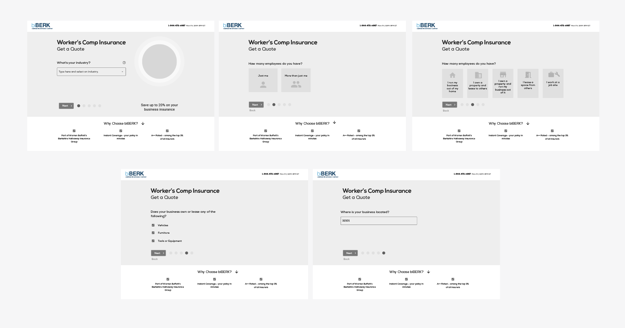
Prototype 1 was designed to be very similar in page layout, functionality and UI as the new design we’d recently released to development for a product application flow. This would support the learnability of the application because the user would not have to interpret and learn the meaning of separate sets of UI features for the recommendation flow and the product application.
Prototype 2 was designed to purposely stand apart from the product application flows by following a different page layout and UI style. Since the recommendation flow would come before the application, making that short portion of the application fun, satisfying and easy would encourage the user to begin the process. We also believed that the distinct UI would provide extra clarity to the user at the point at which they’ve moved from the recommendation flow to the main application.
Research Exercise
Moderated Usability Interviews
Next we completed two rounds of moderated remote usability interviews with small business owners. The aim of these 45 minute sessions was to compare and contrast the usability of the two prototype options as well as collect some follow-up research on the 3 competitors’ flows. Participants were provided with a business scenario for each task instead of using their actual business information so we could see different users attempting the exact same action. To ensure that users weren’t influenced by the order in which they reviewed the different options, we rotated the order in which the prototypes and the competitor flows were presented.
We learned that Prototype 2 performed better with participants and we took away some additional new learnings that we next incorporated into an updated prototype.
Final Unmoderated Usability Research
A final round of unmoderated usability research showed no major problems. A few small tweaks were incorporated before the prototype moved into a visual design phase.
UX Solution
One of the biggest challenges in this project was around the functionality of the industry picker – the way the user indicates the industry in which their business operates. We had identified the existing method as a major point of frustration and confusion for users. We saw variations on this from different competitors and considered several adaptations in our early wireframes and prototypes.
But ultimately, we learned that the existing functionality had a lot of merit in relationship to the needs of this particular audience of users and the type of information biBERK needed to collect in order to provide an accurate quote. What was needed was a smart clean up rather than a total overhaul. To achieve this, we recommended:
Greater consistency in the syntax of the item naming
Greater implementation of search functionality that would trigger results based on synonyms
Shortening of some item descriptions
Wrapping of long item names on mobile instead allow them to be run off the screen
Improved speed in the database response time to present search results
In the end, we developed revised the recommendation flow with a look and experience that is distinct from the rest of the application through a unique layout, easy, engaging input styles. We believe the distinct look coupled with tweaks to the language syntax and question flow will be more considerate of there user’s ability to understand the process, accomplish the task quickly and accurately, and feel confident in the trustworthiness of biBERK as an insurance provider.
UX/UI Design


